PointCast / Field study 01

Pantone / The systems behind the surface

Color,
by agreement.

How a tiny reference made a very big world speak in color. And what we could build from the same idea.

Start with your own eyes ↓

A case study for Michael Hoydich · Research checked 25 October 2026
Editorial and original tools by Codex · Independent, not affiliated with Pantone

Original abstract composition of colored shapes and reference marks
Original color study. Screen approximations, not Pantone samples.
Every color on this page is a screen approximation. Demonstrations use original colors, not Pantone standards or production conversions. A physical proof remains a different thing.

First, a small experiment

Same color.
Different company.

The two small squares below have identical sRGB values. Change their surroundings. Does one seem brighter, duller, warmer? Your experience may vary; the pixels do not.

A / dark surround
B / light surround

Both squares: sRGB #C37655 · RGB 195, 118, 85.

An actual same-pixel comparison, not a simulation of ink or a vision test. Color appearance also depends on the viewing situation. ICC: color, illumination and observation ↗

01 / What is Pantone?

A name. A reference.
A way to agree.

“Make it red” is a conversation. “Match this identified reference, on this material, under these conditions” is a handoff.

Pantone is a commercial color company best known for the Pantone Matching System, or PMS. It connects named and numbered colors to physical references and production information. A designer and printer can refer to the same target without standing in the same room. The company also develops material-specific systems, digital tools and consulting services. Pantone: company overview ↗

Think of a code as an address, a sample as evidence, and a proof as a test of the actual job. Those roles work together. An identifier alone does not contain the paper, light, coating, machine settings or person looking at the result.

A Pantone printing reference and a Fashion, Home + Interiors reference are not interchangeable instructions. Cotton, paper and plastic involve different materials and workflows. Choose the relevant system and edition before specifying the sample. Pantone: color systems ↗

Our reading of the case: Pantone's useful invention is an agreement that can travel.

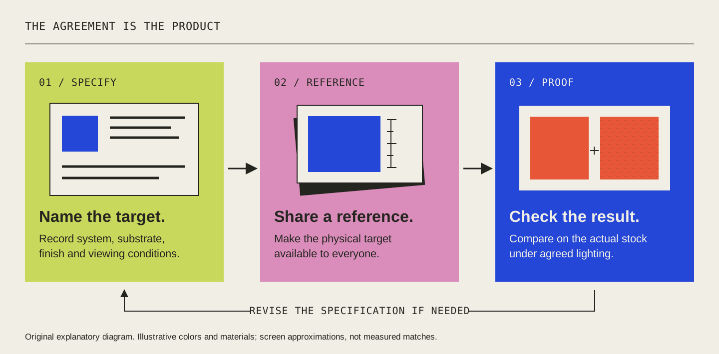
A specification travels through a physical reference, production conditions and proof approval
Original explanatory diagram. A shared target still needs a controlled test.

02 / A short, consequential history

From the print shop
to the cultural calendar.

Select a moment. The story is a sequence of tools, institutions and changing access—not just a parade of fashionable colors.

1956–1963

A color matcher builds a common language.

Lawrence Herbert joined Pantone as a color matcher in 1956, purchased the company in 1962, and developed the Pantone Matching System in 1963. The company's earlier existence and the system's launch are different dates.
Hofstra: Lawrence Herbert biography ↗

03 / The production lab

One intention.
Three different machines.

Color on a display is light. Color on paper involves inks and a surface. Select a workflow to see the kind of instruction it needs.

Choose a workflow

Changing the surface changes the handoff note, not a fabricated color conversion.

Add light.

A display combines emitted red, green and blue light. Our original colors are expressed as sRGB values. A HEX triplet is a digital instruction—not an ink formula.

A screen preview does not certify the result on coated paper.

Conceptual on-screen illustration only. No gamut conversion, spectral calculation or Pantone matching is performed. Sources: X-Rite: additive RGB · Adobe: spot and process · Pantone: spot vs process.

A

Spot ≠ Pantone

A spot color describes a separately specified ink. Pantone is one reference system. A job can combine process photographs with a dedicated spot-color logo; on a conventional press a spot normally needs its own plate. Adobe ↗

B

The suffix matters

In Pantone graphics guides, C and U distinguish coated and uncoated paper. The same ink recipe produces different appearances on those surfaces. Coated does not always mean glossy. Specify the stock, not a CSS shine. PantoneLIVE specifications, p. 5 ↗

C

Conversions have limits

Different devices and processes have different gamuts. Some spot colors cannot be closely reproduced by a given CMYK process. ICC profiles describe device relationships; they help manage a transformation without making every output identical. ICC FAQ ↗

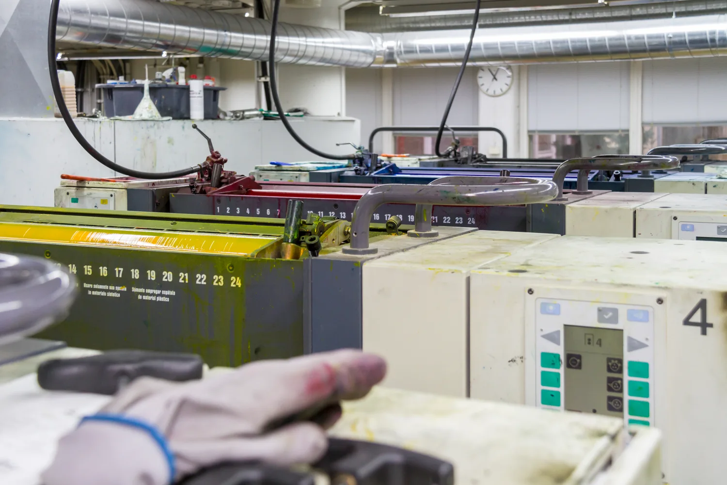
A MAN Roland sheet-fed offset press in a printing workshop
Production is physical. MAN Roland offset press, 9 October 2013. Aatu Dorochenko / Wikimedia Commons, CC BY-SA 4.0. Resized and converted to WebP; derivative under the same license.
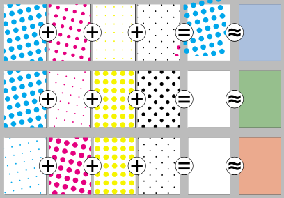
Three rows show separate cyan, magenta, yellow and black patterns, their combination, and the perceived result
Color halftoning: Slippens; vector by Pbroks13. Public-domain dedication and source. Unmodified SVG; explanatory screen diagram, not a Pantone chart.

The important fine print

The reference travels.
The conditions do not.

The goal is controlled communication, not the disappearance of context.

Two samples can match under one light and separate under another. That is metamerism. A photograph of a sample also adds camera and display interpretation. Neither a screenshot nor a familiar number removes the need to examine the intended material. X-Rite: metamerism ↗

What belongs in a useful specification?

System and identifier; guide edition; substrate and finish; printing or manufacturing process; viewing and measurement conditions; reference revision; acceptable tolerance agreed with the producer; and the person who approves a physical proof. This is our practical checklist, not a Pantone certification protocol.

Why does an old guide need attention?

Handling, fading, humidity and paper aging affect physical references. A guide is a maintained tool. Record its edition and condition; follow the supplier's recommendations rather than treating a worn sample as timeless. Pantone: graphic design systems ↗

What does ownership mean here?

Pantone's reference systems, branded products and digital libraries are commercial offerings. Licensing and access terms matter when building workflows. This page discusses the system; it does not reproduce a full proprietary library or offer certified matches. The existence of a commercial standard does not make every color in nature proprietary. Pantone overview · Connect plans.

What can't this screen show?

Actual metallic reflection, fluorescence, tactile texture, aging, and every producible spot color. The material images and animations here explain ideas. They are not physical samples, measured color data or print proofs.

04 / Business + culture

When a tool
becomes a language.

Pantone operates at two tempos: a production reference asks for repeatability; a cultural forecast asks for attention. They are related businesses with different kinds of evidence.

01 / Reference

A shared target

Physical guides and material standards give teams something concrete to compare.

Products and systems ↗
02 / Workflow

Access in the tools

Connect brings digital libraries and color work into design workflows. Plans and availability change.

Current Connect offering ↗
03 / Advice

Decisions about color

The Color Institute offers trend forecasting, consulting and custom color work.

Color Institute ↗
04 / Culture

A story people share

Color of the Year, licensing and partnerships bring a specialist language to a wider audience.

2026 selection ↗

The coordination advantage

Our interpretation: when customers, suppliers and software already recognize a reference, adopting it reduces explanation. The value lives partly in the network of people who can act on the same instruction. The physical sample and the language reinforce one another.

The tension is dependency. Teams gain a shared vocabulary while relying on the availability, maintenance and terms of its tools. Adobe's 2022 transition away from preloaded Pantone books makes access a practical workflow question. This is a distribution and licensing change, not evidence of a private dispute. Pantone: Connect × Adobe FAQ ↗

A yearly conversation, not a law

Pantone's 2026 selection is PANTONE 11-4201 Cloud Dancer. Pantone presents it through a story of calm and reflection. That emotional reading is the company's cultural interpretation, not a universal psychological response. We identify the selection in words rather than passing off an invented screen swatch as the standard. Pantone's official 2026 page ↗

This business map does not estimate revenue, market share or proven commercial impact. Its useful question for makers is smaller: which repeated misunderstanding would a common reference help you resolve?

Read the Industry Next business companion ↗

05 / Original local materials lab

A small palette.
A better handoff.

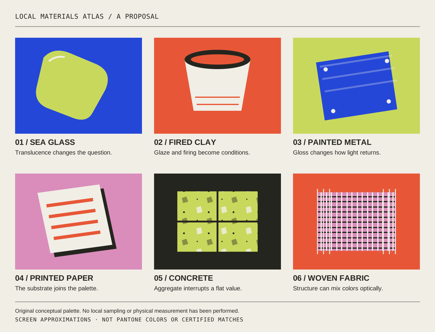
Compose a three-color study for a local project. These names and sRGB colors are original artistic interpretations of coastal and workshop materials—not measured samples, official civic colors, or Pantone matches.

Original geometric interpretations of local workshop and coastal materials; not measured samples
Original material studies. These illustration colors are independent of the editable palette below.
Choose your color roles
Give the idea a destination
LOCAL / 90245STUDY 001

Make
something
together.

ORIGINAL MATERIALS PALETTE
SCREEN STUDY / NOT A COLOR STANDARD

Your specification passport

Neighborhood poster / draft 01

Proof status: Unproofed concept. No supplier, production run, physical approval or certified match is implied.

Everything happens in your browser. No account, upload, paid API or server save. Downloads contain your current choices and their limits. Text contrast is calculated for the preview only; it does not certify print readability. W3C contrast guidance ↗

06 / What could we build in parallel?

Borrow the pattern.
Invent the reference.

Three original proposals for local makers, PointCast and UES. None is an operating service, validated business or Pantone partnership.

Surface Atlas / proposal

“Soft matte”
needs a sample.

Build a small physical library of local materials: board, powder coat, fabric, glaze. Give each sample an original ID, finish process, revision and care history. Photographs help browse; touch and controlled inspection decide.

First test: two makers choose a finish from adjectives, then from a sample record. Compare disagreement and rework before claiming an improvement.

PointCast could publish the field notes; UES could study the evidence; local makers could decide whether the reference is useful.

Light Passport / proposal

“Warm and welcoming”
needs conditions.

Pair an original scene ID with fixture model, placement, settings, room surfaces and measured conditions at a stated location. A portable intention still needs a room-specific implementation.

First test: two teams recreate three scenes from a passport versus prose alone. Compare measured conditions and observer ratings separately.

An Industry Next product-system experiment: sell less ambiguity only after proving that the record helps.

Motion Index / proposal

“Make it calm”
needs a behavior.

Name original interface motion tokens by duration, easing, distance and interruption behavior. Include a reduced-motion alternative in the same record. A token should be inspectable and implementable.

First test: two builders reproduce a transition from adjectives versus a token. Measure timing and trajectory; ask about preference as a different question.

UES could make the comparisons; PointCast could host small, accessible demonstrations.

Continue at the University of El Segundo

Turn the case into a practice.

A 45-minute independent module: compare, specify, test your understanding, and download a mini-brief. No enrollment or academic credit.

Open the teaching studio ↗

Reading desk / evidence & credits

Follow the references.

Research checked 25 October 2026. Company sources describe their own products; our business lessons and local proposals are interpretation. No full Pantone database, logos, endorsements or fabricated historical images are used.

History & institutions

Color & production

Images & original work

The offset press photograph is licensed CC BY-SA 4.0. The halftoning SVG is public domain. Full credit appears next to each image.

The color field, reference diagram and materials illustration are original code-native vector artwork made for this study. Palette downloads use our original sRGB values.

Read the asset provenance ↗

A browser illustration is not a physical proof. Pantone and related product names belong to their respective owners.